Data visualization is a powerful tool that can be used to help understand and communicate data. It allows users to see the information visually and makes it easier to interpret large data sets, improve data analysis, and understand big data.
This can be done using various graphs, charts, and diagrams. Individuals, companies, and organizations use data visualization tools to analyze data effectively. However, there are specific tools that are more popular than others. This article will review 30 free vs. paid data visualization tools and decide which best suits your needs types of data visualization.
Free Data Visualization Tools
Jupyter

Source: Jupyter
Jupyter is an open-source tool for creating interactive data applications in web application notebooks. It’s the primary interface used by the data science community to share code, analyses, and results. Jupyter Notebooks are a powerful tool for data visualization.
Jupyter is a powerful, open-source tool for data analysis. It’s free and easy to use. With Jupyter notebooks, you can easily share your code, text, and visualizations online to collaborate with other scientists.
Pricing:
- Free Version
Microsoft Power BI

Source: Microsoft
Microsoft Power BI is a cloud-based business intelligence service that provides data analysis and many data visualization tools to users. It enables users to develop interactive dashboards and visualizations by combining data from multiple sources and provides an interface for exploring that data in various ways. The Power BI website also includes several pre-made dashboard templates, which can be customized to meet the needs of individual users.
Power BI has many features that are useful for analyzing and visualizing data. It offers many charts and graphs, including bar charts, line graphs, pie charts, scatter plots, heat maps, etc. Users can also choose from various map types to visualize their geographic data differently. In addition to these chart types, users can also create their custom charts using Power BI’s built-in chart editor tool.
Pricing:
- Free Version
Google Data Studio
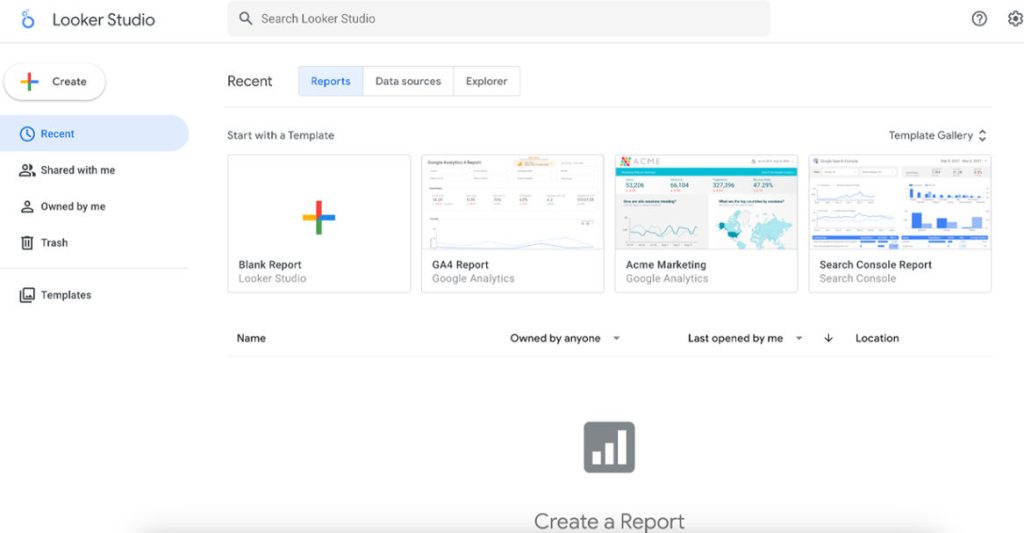
Source: Looker Studio
Google Data Studio is a data visualization tool from Google. It is free and helps you create and share professional reports, visualizations, dashboards, and more.
Google Data Studio is an easy-to-use web-based reporting platform that provides a wide range of features for creating interactive reports and offers accessible powerful data dashboards and visualizations. You can use it to get more insights into your business data and make better decisions based on data.
Pricing:
- Free Plan
Openheatmap

Source: OpenHeatMap
Openheatmap is a data visualization tool designed to create heat maps. It is an online service, and it works very well. The user interface is straightforward to use. This website will be familiar and easy to navigate for anyone who has ever used Google Maps.
The tool allows you to create a heatmap from any geo-location data. This is great for tracking traffic and sales or any other type of data related to location.
The tool also allows you to use your data or import it from other sources like Google Spreadsheets, Dropbox, or even CSV files.
Pricing:
- Free Version
Whatagraph
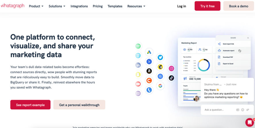
Source: Whatagraph
Whatagraph is a data visualization tool that can create attractive and informative charts, tables, and infographics from your data. It features an easy-to-use interface that allows you to modify the visual aspect of your graphic by adjusting color schemes, fonts, and other styles.
Whatagraph also provides several templates for standard charts such as bar charts, line graphs, pie charts, scatter plots, and others.
Pricing:
- Free Version
Datawrapper

Source: Datawrapper
Datawrapper is a tool for creating charts and maps. It is free to use and offers a wide range of chart types, allowing you to create everything from simple line charts to complex maps.
Datawrapper makes it easy to turn your data into a visual representation. You can choose from over 80 different chart types, including column charts, bar charts, line charts, and scatter plots, as well as more advanced options like bubble charts or heat maps. Each type of chart has its customization options that allow you to tweak the design until it looks just right.
Once you have created your chart, save it as an image file or copy the code for embedding it in websites or presentations. Datawrapper also offers an API that allows developers to use their platform in their applications.
Pricing:
- Free Version
Leaflet

Source: Leaflet
Leaflet is a data visualization tool that lets you create interactive maps. It’s free and open source, but it’s also compelling. If you are looking for a simple way to make your map more dynamic and engaging, this is an excellent option.
The leaflet is a JavaScript library for interactive maps. It is designed with simplicity, usability, and performance in mind. Leaflet is a widely used library that is very easy to use and offers many advanced features, including fast tile rendering, hardware-accelerated CSS styling, and touch gestures.
Pricing:
- Free Version
Chartbuilder

Source: Chartbuilder
Chartbuilder offers a range of charts and graphs for your website. It is an online tool that allows you to create high-quality charts easily. Chartbuilder can customize your chart in various ways with different chart types and options available.
Chartbuilder is an easy-to-use software that allows you to create professional-looking charts with just a few clicks. It is ideal for business users who need a quick way to create charts and web developers who want to use JavaScript libraries on their websites without having to learn how to code them from scratch. The software allows you to create simple and complex charts, including pie charts, bar graphs, line graphs, and more.
Pricing:
- Free Version
Open Refine

Source: OpenRefine
Open Refine is a tool that allows you to clean, process, and visualize data. It’s an open-source project, and it is also available as a cloud-based service. Open Refine has an intuitive interface, allowing users to drag and drop columns into different fields. This makes it easy to quickly manipulate large amounts of data without knowing anything about programming or computer science.
Pricing:
- Free Version
Visme

Source: Visme
Visme is a powerful tool that helps you create data visualizations of your own. The software features a variety of templates and over 200 chart types. The templates are handy for those who need more time or knowledge to create their charts from scratch. Visme’s interface is intuitive and intuitive, making it ideal for both novices and experienced users. It provides a library of charts and templates that can be accessed at any time, even when offline. Users can add images and text to their charts by dragging and dropping them into the canvas area.
The software also offers several other exciting features, including adding audio clips to your presentations and video clips from YouTube or Vimeo. This allows you to add an extra dimension of interactivity to your slide show by incorporating sound effects and music!
Pricing:
- Free Version
Chartlet

Source: Boating Safety Tips
Chartlet is a free, web-based data visualization tool that allows you to create beautiful charts with just a few clicks. The device is ideal for non-programmers who want to make their own charts and graphs. Still, it’s also powerful enough for experienced developers looking for a quick way to visualize data.
You can use Chartlet to create simple pie charts, bar graphs, line graphs, and more. It’s easy to add labels and change colors or other attributes of your chart. You can also save your work as a PNG file on your computer or share it with others via email or social media.
Pricing:
- Free Version
Canva

Source: Canva
Canva is a web-based application for creating data visualizations. Canva has an extensive library of templates and layouts that can be used to create infographics, social media graphics, and other types of data visualizations. Canva is free to use, but if you’re looking for more advanced features such as adding text or logos, you’ll need to upgrade to the paid version (which also includes access to unlimited images).
Pricing:
- Free Version
Infogram

Source: Infogram
Infogram is a data visualization tool that helps you make beautiful charts, maps, and infographics. It’s perfect for anyone who needs to create professional-looking designs quickly and easily.
You can embed your infographic into any website, blog post, or social media campaign with just one click — no coding required. And because Infograms look so good on any device, they’ll help you attract more customers wherever your audience happens to be: desktop computers, smartphones, or tablets.
Infogram also makes it easy for people to share your creations on social media platforms like Facebook, Twitter, and LinkedIn.
Pricing:
- Free Version
Matplotlib

Source: matplotlib
Matplotlib is a powerful library for creating 2D plots, graphs, and other visualizations. It is a Python-based plotting library, which means it can be used in any Python-based platform. Matplotlib is an excellent tool for data visualization. Many companies have used it for their analysis and reporting purposes. Matplotlib is a Python library that can create simple and complex plots, histograms, bar charts, error charts, scatterplots, and many more.
Pricing:
- Free Version
Flourish Public

Source: Flourish
Flourish Public is an extensive, free collection of data visualization tools. It contains all the most valuable tools for creating and sharing interactive content on the web, including a wide selection of charts and graphs, an infographic maker, a timeline creator, and more.
Flourish Public provides a great tool to create any chart or graph you need to visualize your data: bar charts, line charts, pie charts, and many more. You can also create infographics by choosing from a wide selection of templates and adding text and images.
Flourish Public has an infographic maker that allows you to create infographics in just a few clicks! The infographic maker includes templates for different types of infographics, such as world maps, timelines, or flowcharts.
Pricing:
- Free Version
Paid Data Visualization Tools
Tableau Public

Source: Tableau Public
in web pages. You can also share individual worksheets or entire dashboards. When you share your work on Tableau Public, you have complete control over who can see your dashboard and what information they can see.
Pricing:
- Tableau Creator: $75 per month
- Tableau Explorer: $42 per month
- Tableau Viewer: $15 per month
Zoho Reports

Source: Zoho CRM
Zoho Reports is a web-based application that helps you to analyze your business data and generate reports. This software is an all-inclusive data analytics tool that allows you to create complex charts, graphs, maps, and tables. In addition to this, the software also provides you with a wide range of features such as scheduling, filtering, and exporting of reports. You can also use this application to share your information with your team members or clients via email or Dropbox.
ZOHO Reports offers a wide range of visualizations, such as charts and graphs, that are highly customizable according to your needs. The dashboard feature allows users to view multiple reports at once and drill down into details by clicking on any specific information. It is also possible for users to export their data into various formats such as CSV, XLSX, PDF, etc.
Pricing:
- Basic: $24 per month
- Standard: $48 per month
- Premium: $115 per month
- Enterprise: $455 per month
- Custom: Contact ZOHO Reports for pricing details
Visual.ly

Source: Visually
Visual.ly is the world’s largest community for data visualization, with over 3 million users and hundreds of thousands of projects created. Visual.ly helps you create beautiful, interactive data visualizations quickly and easily. Visual.ly provides an intuitive drag-and-drop interface that lets you create stunning, shareable visualizations in minutes.
You can also access an extensive library of professionally designed templates for inspiration or use our data connector to pull in your data from sources such as Google Spreadsheets or Salesforce.
Pricing:
Sisense

Source: Sisense
Sisense is a powerful and intuitive business intelligence platform that helps you make better decisions. Use it to create interactive dashboards, build reports, and share insights with your team from any device.
Sisense provides an end-to-end data visualization platform for all your business needs. As a self-service BI tool, it offers an easy way to explore data and make sense of it. With Sisense, you can create interactive dashboards, reports, and visualizations that help you make better decisions faster.
Pricing:
FusionCharts

Source: FusionCharts
FusionCharts is a popular data visualization tool that creates interactive charts, graphs, and infographics for websites, mobile apps, and presentations. FusionCharts provides over 100 chart types and a wide range of charting tools. It supports all major browsers, including IE6+, Safari, Chrome, Firefox, Opera etc. The FusionCharts Suite includes more than 90 components that can be used to create complex dashboards with highly customizable charts & maps. FusionCharts also supports dynamic reporting with real-time data streaming features.
Pricing:
- Basic: $499 for one developer per year
- Pro: $1,899 for four developers per year
- Enterprise: $3,399 for ten developers per year
- Enterprise+: Contact FusionCharts for pricing details
Grafana

Source: Grafana
The popular open-source tool for data visualization, Grafana is a powerful platform for creating beautiful dashboards. It is one of the best-known and most widely used open-source projects today. Grafana features many charts that can be customized to suit your needs. Grafana supports many different chart types, including bar charts, line graphs, and pie charts. Users can also create custom charts based on the type of data being presented in the dashboard.
Pricing:
- Cloud Pro: $29 per month
- Cloud Advanced: $299 per month
Piktochart

Source: Piktochart
Piktochart is a data visualization tool that lets you create and share infographics, flowcharts, posters, presentations, and more. It’s easy to use yet powerful enough for professionals. Piktochart is a cloud-based software that allows users to create any graphic using pre-existing templates or starting from scratch. Piktochart has a library of over 1,000 free templates for creating everything from infographics to data visualizations. If you want something more custom, you can use their drag-and-drop interface to create an infographic from scratch.
The software can be used by anyone who wants to make an impact with their content — whether you’re trying to sell something online or share some information with friends and family.
Pricing:
- Pro: $29 per member per month
- Business: $49 per member per month
- Enterprise: Contact Piktochart for pricing details
Plotly

Source: Plotly
Plotly is an excellent tool for creating data visualizations that can be used in presentations or publications. The website allows you to upload your data, select from various chart types, customize settings such as colors, fonts, and legends, and then share the final product on social media or download it as an image file. Additionally, you can export plots as either JPG or PNG files.
Plotly is a versatile platform that is widely used by journalists, researchers, and businesses from various industries. It allows users to present their data in several ways, such as scatter plots, line graphs, and bar charts, among other options available on the website’s interface. Additionally, Plotly provides other features like the ability to create custom axes to suit users’ specific needs.
Pricing:
- Dash Vendor for Teams: Contact Plotly for pricing details
- Dash Enterprise On-premises: Contact Plotly for pricing details
- Dash Enterprise Cloud: $50,000 per year
Domo

Source: Domo
Domo is a data visualization tool that allows users to create beautiful, interactive dashboards and reports. Domo provides real-time data integration with all of your data sources, including databases, spreadsheets, cloud storage, social media, and more. Domo’s suite of tools makes it easy for anyone in your organization to build powerful business applications and share them throughout the enterprise.
These apps can be embedded into business applications or accessed through the cloud. Domo’s unique data visualization capabilities allow users to visualize their business data with charts, maps, and informative and beautiful graphs.
Pricing:
- Talk to Sales to get your customized pricing.
TIBCO Spotfire

Source: Spotfire
TIBCO Spotfire is the leading data visualization and analytics platform for business intelligence. TIBCO Spotfire is a powerful solution to help you make sense of your data by providing an easy way to visualize your information in charts, tables, and maps.
TIBCO Spotfire offers a variety of ways to view your data, including charts, tables, dashboards, and maps. You can also create custom views tailored to your specific needs. You can also use TIBCO Spotfire as an interactive analysis tool. For example, you can adjust the size or color of a bubble chart to view more detail about specific data points or compare multiple values at once.
Pricing:
- Contact TIBCO Spotfire for pricing details
TeamMate Analytics

Source: Wolters Kluwer
TeamMate Analytics is a data visualization software that allows you to easily see your team’s performance in different areas. The software has built-in dashboards and reports that will help you understand the performance of your team. TeamMate Analytics comes with a dashboard builder so that you can create custom dashboards for each department or project in your company. The dashboard builder makes it easy for you to customize your dashboard based on the needs of your business.
TeamMate Analytics comes with pre-built reports that cover a wide range of topics, from team productivity to employee satisfaction. You can also create new accounts using the report builder feature of TeamMate Analytics. The software offers several ways to visualize your data: table charts, bar charts, line graphs, pie charts, and more!
Pricing:
- Contact TeamMate Analytics for pricing details
Qlik

Source: Qlik
Qlik’s data visualization tools help you uncover hidden insights, make better decisions faster, and ensure compliance with regulations while improving customer experience. The platform makes it easy to share your dashboards across the organization and collaborate with partners or customers to gain a holistic view of the business. The intuitive interface provides a full range of capabilities, including drag-and-drop functionality, point-and-click filtering, and drill-down capabilities.
Pricing:
- Contact Qlik for your needed pricing.
DataPine

Source: DataPine
DataPine is a data visualization tool that helps you create interactive charts and dashboards. It has a drag-and-drop interface which makes it easy to create charts and graphs. You can also create interactive dashboards, which can be shared with others.
DataPine has many chart types, such as bar graphs, line graphs, scatter plots, and pie charts. The software also allows you to customize your charts by changing the color scheme or adding animation effects. You also have access to more than 20 different chart types for creating infographics. DataPine also has features such as comparing two data sets in an interactive dashboard, exporting charts as PNG images or PDF documents, adding filters, and sorting data by clicking column headers.
Pricing:
- Basic: $249 per month
- Professional: $449 per month
- Premium: $799 per month
- Branding & Embedding: $1,099 per month
DataBox

Source: DataBox
DataBox is an online tool to create interactive charts, graphs, and maps. It allows you to upload your data and make interactive visualizations in just a few clicks. DataBox provides a wide range of charts, including bar charts, pie charts, line charts, and more. You can also use DataBox to create heat maps and maps.
DataBox makes sharing your visualizations with others easy by creating an embed code that can be transmitted through social media or embedded on any website. You can also download the code for an HTML file that you can use on your blog or website.
DataBox provides several options for exporting your visualizations in different formats like JSON or CSV files so you can use them in other applications such as Google Spreadsheets or Excel.
Pricing:
- Starter: $59 per month
- Professional: $169 per month
- Growth: $399 per month
- Premium: $999 per month
Looker Data Science

Source: Looker Data Science
Looker Data Science is a data visualization tool. It allows users to search and visualize data from multiple sources, including databases, cloud files, and spreadsheets. Users can connect to Looker through a browser or the company’s mobile app. The Looker platform has pre-built dashboards that users can customize according to their needs.
The dashboard builder allows users to drag and drop widgets onto their dashboard, which they can customize using colors, fonts, and other elements. Users can also choose from a wide selection of templates in Looker’s library. They can add new widgets by clicking the plus sign next to each category (e.g., bar charts).
Pricing:
- Viewer: $30 per user per month
- Standard: $60 per user per month
- Developer: $125 per user per month
Data Visualization Tools Examples
- Tableau: A widely-used data visualization tool, Tableau allows users to create interactive and shareable dashboards. It is known for its ability to handle large datasets and generate a wide variety of visualizations, from bar graphs to heat maps, helping businesses analyze data more effectively.
- Power BI: Developed by Microsoft, Power BI offers robust data visualization capabilities with real-time data monitoring and rich dashboard reports. It integrates well with other Microsoft products and is ideal for businesses looking to visualize data from multiple sources.
- Google Data Studio: A free tool by Google, Google Data Studio lets users create customizable reports and dashboards using data from various sources like Google Analytics, Google Ads, and third-party platforms. Its user-friendly interface makes it accessible for beginners while offering powerful visualization options for more advanced users.
Conclusion
Concluding our comparative guide, it’s clear that when it comes to turning complex data into comprehensible visuals, that’s where data visualization tools shine. Both free and paid options offer unique advantages, making the choice between them highly dependent on specific needs and resources. Free tools provide an accessible entry point for individuals and organizations looking to explore data visualization without financial commitment.
They prove that cost doesn’t necessarily dictate quality, offering robust features for basic to moderately complex projects. However, there’s a limit to the scalability and customization they offer, which is where paid tools come into play.
Paid tools, on the other hand, cater to a more demanding user base that requires advanced functionalities, greater customization options, and dedicated support. This isn’t to say that paid options are the ultimate solution for everyone; rather, it’s also one of the key considerations in our comparison. They often come with a learning curve and a price tag that might not be justifiable for smaller projects or those with limited budgets.
The best choice varies by the user’s priorities, whether it’s the simplicity and cost-effectiveness of free tools or the advanced features and support of paid solutions. For more articles about data visualization tools, please read our other blog now. While you’re here, fill in the form to subscribe and get the hottest deals and discounts on selected software.
FAQs
What is Data Visualization?
Data visualization is the process of turning data into an image. It helps people understand data better and make decisions based on it. As a result, it is one of the most important tools in business intelligence, marketing, and social media analytics.
Why Do I Need a Data Visualization Tool?
Data visualization tools can help you understand your data better, present it efficiently, and make it more attractive to read. It will also help you filter out information that is unimportant to you or your business so that you can focus on what matters.
What Is the Difference Between Free and Paid Data Visualization Tools?
The main difference between free and paid options is that paid options offer more capabilities, such as advanced charting features, multiple dashboards, sharing capabilities, etc.