
Diving into the world of marketing analytics can often feel like swimming in a sea of endless numbers and complex datasets. But what if you could make all that data not only more digestible but also visually engaging? That’s where the power of data visualization comes into play.
If you’re ready to transform how you present data, look no further. We’re about to explore twenty-one of the best data visualization tools designed specifically for marketing. These tools not only provide stunning data visualization examples but also simplify the process of visualizing data, ensuring that your insights pop off the page.
Whether you’re a seasoned data analyst or a marketer looking to up your game, these tools will help you see your data in a new light. Visualization also becomes a breeze, allowing you to communicate complex information in a way that everyone can grasp. So, let’s dive right in and see how these tools can enhance your marketing strategies by making your data comprehensively visual and immediately impactful.
Sprout Social
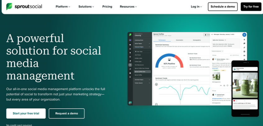
Source: Sprout Social
Sprout Social data visualization is a great way to make all of your social media data more accessible and easy to understand. Sprout Social makes it easy for you to see all of your social media metrics in one place, which can be quite overwhelming if you’re not used to looking at a lot of data in one place. The good news is that there are some great ways to visualize this information so that it’s easier for you to digest and understand.
- Standard: $249 per month
- Professional: $399 per month
- Advanced: $499 per month
- Enterprise: Contact Sprout Social for pricing details
Discover the most robust and cohesive social media business solution, built to scale. Upgrade as you grow or cancel anytime.

HubSpot
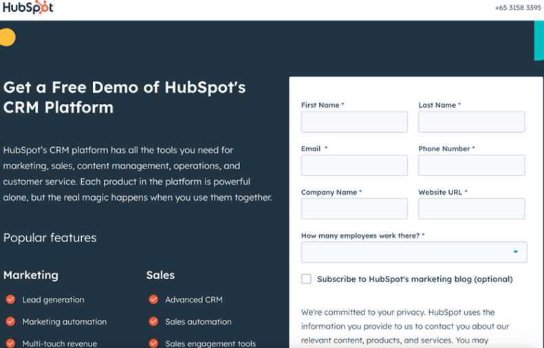
Source: Hubspot
HubSpot is one of the best data visualization tools available on the market. It provides users with a platform to create and share beautiful visual content for their business. Many companies have used the tool to improve their marketing campaigns and increase sales. HubSpot is a handy tool for marketers, especially if you want to use infographics in your online marketing strategy. It has all the necessary tools to help you easily create high-quality infographics.
- Contact HubSpot for pricing details.
Transform your business into a revenue generating machine by creating delightful customer experiences.

Microsoft Power BI
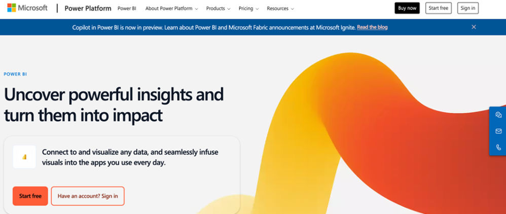
Source: Microsoft Power BI
Microsoft Power BI is a data visualization tool that helps you make sense of your data. It’s easy to use and provides powerful visualizations, dashboards, and reports that allow you to quickly find insights, tell compelling stories, and share them with others. Power BI allows you to connect to hundreds of data sources — from Excel worksheets to Salesforce accounts — and bring your information together in one place. You can create visuals for any topic or audience to make better business decisions based on the most important numbers.
Pricing:
- Free Version
- Power BI Pro: $10 per month
- Power BI Premium: $20 per month

Moosend
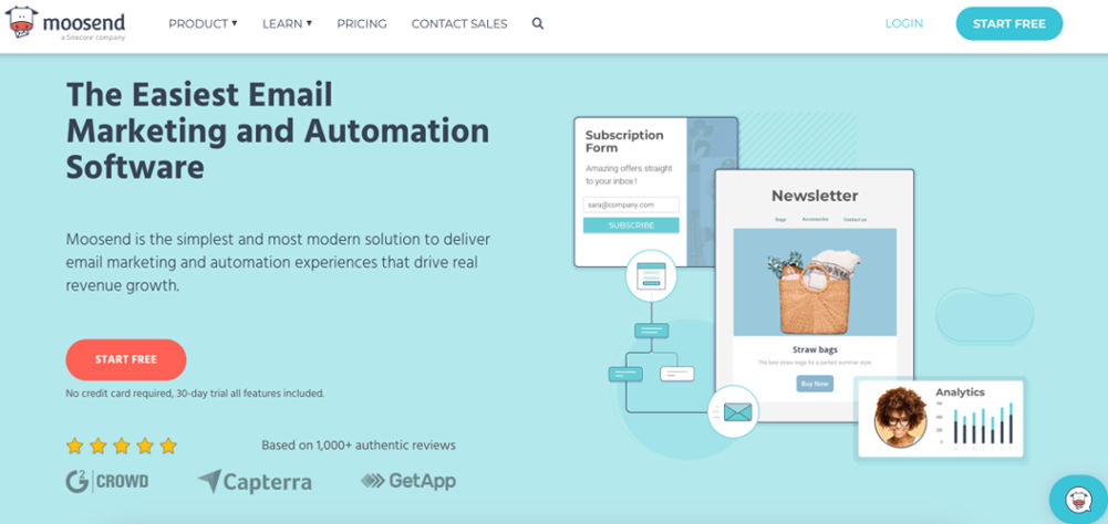
Source: Moosend
Moosend is a cloud-based data visualization tool for small businesses and freelancers. It allows users to create beautiful interactive reports, presentations, dashboards, and infographics in minutes. Moosend is one of the best data visualization tools because it comes with an intuitive drag-and-drop interface, making it easy to create stunning visualizations without any coding skills. The software also offers a wide range of chart types and layouts that you can use to display your data in the best possible way.
The tool supports all kinds of data sources — including Google Sheets, Salesforce, MailChimp, and more — so you can easily import data into Moosend from any source without worrying about compatibility issues.
- Free Trial
- Pro Plan: $9 per month
- Enterprise: Get A Quote
Moosend is the simplest and most modern solution to deliver email marketing and automation experiences that drive real revenue growth.

ChartBlock
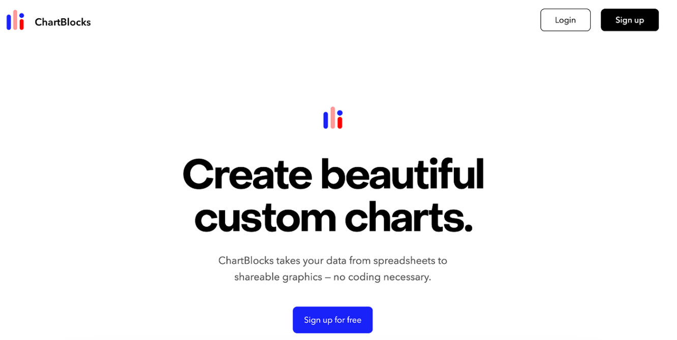
Source: Chartblock
ChartBlock is a data visualization tool that allows you to create beautiful charts and graphs with ease, without any knowledge of coding. It’s the perfect choice for small businesses, freelancers, bloggers, and anyone who wants to share their data engagingly. ChartBlock has over 50 different chart types, allowing you to easily visualize your data in any format you can imagine. Choose from bar charts, line graphs, pie charts, or even geospatial maps. You can also add interactive features like filters and drill-downs — making your data more dynamic than ever before.
Pricing:
- Free Version
- Personal: $8 per month
- Professional: $20 per month
- Elite: $65 per month
Tableau Public

Source: Tableau Public
Tableau Public is a free data visualization tool that allows you to create and share interactive data visualizations on the web. You can also use Tableau Public to view and interact with data visualizations created by others. Tableau Public makes sharing your work easy, with options to download or embed interactive charts and graphs into blogs, websites, social media pages, and more. It has a simple drag-and-drop interface that makes it easy to create charts without having to know how to code. Although it doesn’t offer as many features as other tools on this list (such as R or Google Sheets), it still has all the basic functionality you need to make a compelling chart.
Pricing:
- Tableau Creator: $75 per user per month
- Tableau Explorer: $42 per user per month
- Tableau Viewer: $15 per user per month
Cacoo
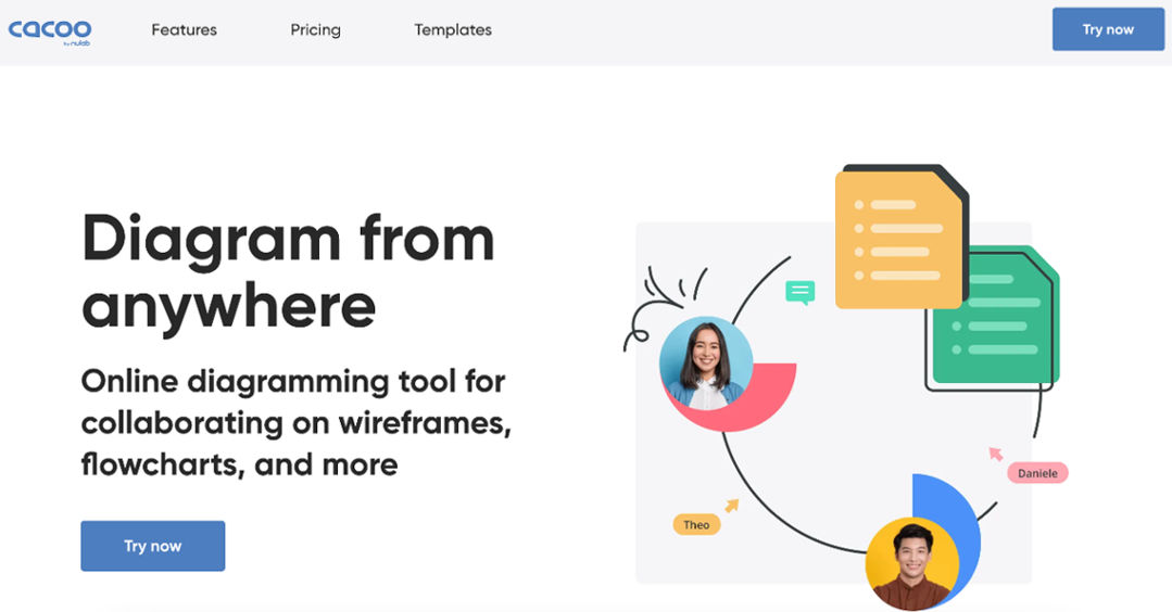
Source: Cacoo
Cacoo is a web-based platform that provides data visualization tools. Cacoo is a free and easy-to-use tool for creating diagrams and flowcharts. It lets you create and share professional charts with your colleagues and clients in minutes.
Cacoo is the perfect tool for creating wireframes, user interface mockups, UI specifications, process flows, business processes, organizational charts, mind maps, website wireframes, etc. It also has many built-in shapes and icons to help you get started quickly. You can also import your images or use existing ones from online royalty-free photo sites such as Unsplash or Pixabay to create beautiful diagrams.
Cacoo supports multiple formats, including PDF, SVG, PNG, and JPEG, so you can easily share your work with others.
Pricing:
- Free Version
- Cacoo Pro: $6 per month
- Cacoo Enterprise: Contact Cacoo for pricing details
Datawrapper

Source: Datawrapper
Datawrapper is a web-based tool to build charts, maps, and graphs. It offers a wide range of chart types, more than any other tool on our list. You can customize your charts with the data you want to show and the look that best represents your data. You can also use Datawrapper to create interactive visualizations, which allow users to filter data by choosing different options.
Pricing:
- Free version
- Custom: $599 per month
- Enterprise: Contact Datawrapper for pricing details
Venngage
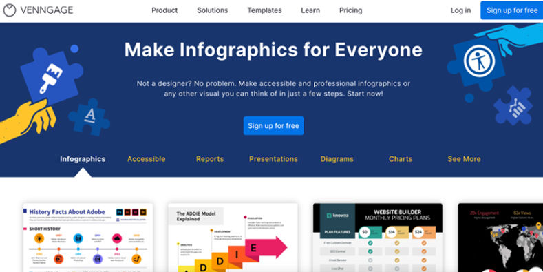
Source: Venngage
Venngage is a data visualization tool that allows you to create beautiful, professional-quality visualizations in minutes. It’s great for marketers looking to create compelling infographics, designers looking to add spice to their portfolios, and anyone else wanting to make data look good. The great thing about Venngage is that it’s very flexible. You can use it as an easy drag-and-drop tool or its more advanced features like editing directly in the browser or accessing your raw data files.
Pricing:
- Free Version
- Premium: $19 per month/per user
- Business: $49 per month/per user
- Enterprise: $499 per month
Plotly
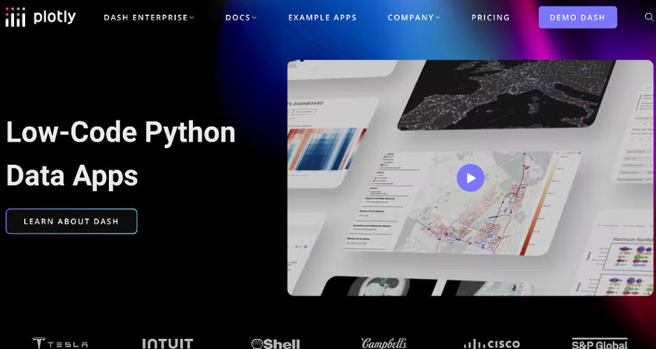
Source: Plotly
Plotly is a powerful tool for data visualization. It allows you to create and share interactive plots, dashboards, and infographics. Plotly is a collaborative platform where users can publish their work, share it with others, and embed it in blogs or websites. The Plotly API allows developers to access and integrate the functionality of Plotly with other applications. Some example API methods include retrieving plot data from a user’s account and creating new plots from scratch. Plotly also offers an embeddable chart viewer that can be embedded in other websites.
Pricing:
- Student: $59 per user per year
- Personal: $396 per user per year
- Professional: $948 per user per year
- On-Premises: $9960 per year
Chartio
Source: Chartio
Chartio is a data visualization tool that makes it easy to create charts, graphs, and maps. It features a drag-and-drop interface so you can quickly build visualizations, and includes some chart types and advanced customization options. Chartio also supports collaboration with colleagues through its online platform, allowing multiple people to work on the same dashboard simultaneously. You can export your charts into PDF or image formats to share with clients or co-workers.
Pricing:
- Startup: $40 per month
- Growth: $60 per month
- Premium: Contact Chartio for pricing details
Infogr.am

Source: Infogram
Infogr.am is a free data visualization tool that allows users to create charts and graphics quickly and easily. The platform has over 100 templates, including infographics and maps, and you can customize these templates with your data. Infogr.am is best suited for creating high-quality visualizations with minimal effort or technical knowledge. Infogr.am’s simple interface makes it easy for beginners to create professional-looking charts in just a few minutes. The platform automatically handles most of the technical details so you can focus on crafting the perfect visual representation of your data sets.
Pricing:
- Free Version
- Pro: $25 per month
- Business: $79 per month
- Team: $179 per month
- Enterprise: Contact Infogram for pricing details
Google Data Studio

Source: Looker Studio
Google Data Studio is one of the most powerful data visualization tools on the market, and it’s getting better constantly. The tool lets you easily create beautiful dashboards with many different types of charts, maps, and other visualizations. Data Studio also allows you to connect to multiple data sources, including Google Analytics, Salesforce, and more. You can then use these connections to pull in your data and create beautiful reports or dashboards.
Pricing:
- Free
IBM Watson

Source: IBM Watson
IBM Watson is a data visualization tool that provides users with the ability to discover patterns, relationships, and outliers in large datasets. Businesses can use the software to identify trends in customer behavior and make predictions based on historical data. The platform also allows users to create their visualizations using a drag-and-drop interface. Data can be imported from Excel spreadsheets, IBM SPSS and SAS files, and other databases like MongoDB and SQL Server.
IBM Watson provides users with several different options for data visualization. Users can choose between bar charts, pie charts, line graphs, and scatter plots. Users can also customize their charts by adding annotations and filters to individual points of interest within the dataset.
Pricing:
- Lite: Free Version
- Plus: $140 per month
- Enterprise: Contact IBM for pricing details
Loomly
Source: Loomly
Loomly is a data visualization tool that helps you create beautiful visuals for your marketing campaigns and social media. It is a cloud-based platform that allows you to create interactive infographics, reports, and dashboards. Loomly’s templates are easy to use and customizable. You can add your content, customize the colors and design, add new charts or graphs, change the layout of your visual elements, change fonts, etc.
Pricing:
- Base: $35 per month
- Standard: $79 per month
- Advanced: $172 per month
- Premium: $359 per month
- Enterprise: Contact Loomly for pricing details
Audiense

Source: Audiense
Audiense is a data visualization tool that allows users to track and monitor the user behavior on their websites.
Audiense has comprehensive features that enable you to gain insights into your business and market performance. With Audiense, you can track your competitor’s websites, see how many visitors they get from different countries, analyze their traffic sources, learn what keywords they use to attract visitors, and much more. Audiense also provides advanced reporting features that help you understand how people use your website. You can also find out which pages are most popular among visitors, which have the highest bounce rate, and more.
Pricing:
- Twitter Marketing: $948 per year
- Audiense Insights: $8352 per year
- Audiense Insights Unlimited: $25,000 per year
SendGrid
Source: Twilio SendGrid
SendGrid data visualization is a powerful tool that helps you visualize your SendGrid account better. It’s a web-based SaaS application, and anyone can use it to get their SendGrid account statistics. The SendGrid data visualization tool lets you view your email stats in real-time, which can be useful for tracking how your campaigns are performing.
Pricing:
- Free Version
- Essentials: $19.95 per month
- Pro: $89.95 per month
- Premier: Contact SendGrid for pricing details
Lemlist
Source: Lemlist
Lemlist is a data visualization tool that helps you to create charts, maps, and other types of visualizations quickly. It has an easy-to-use drag-and-drop interface and supports a variety of data sources, including Google Spreadsheets, Microsoft Excel, JSON, and more. Lemlist offers a wide selection of charts and maps, including pie charts, bar graphs, line graphs, and heat maps. You can customize your charts by adding labels, color schemes, and other elements.
Pricing:
- Email Outreach: $59 per seat per month
- Sales engagement: $99 per seat per month
- Enterprise: Contact Lemlist for pricing details
Highcharts
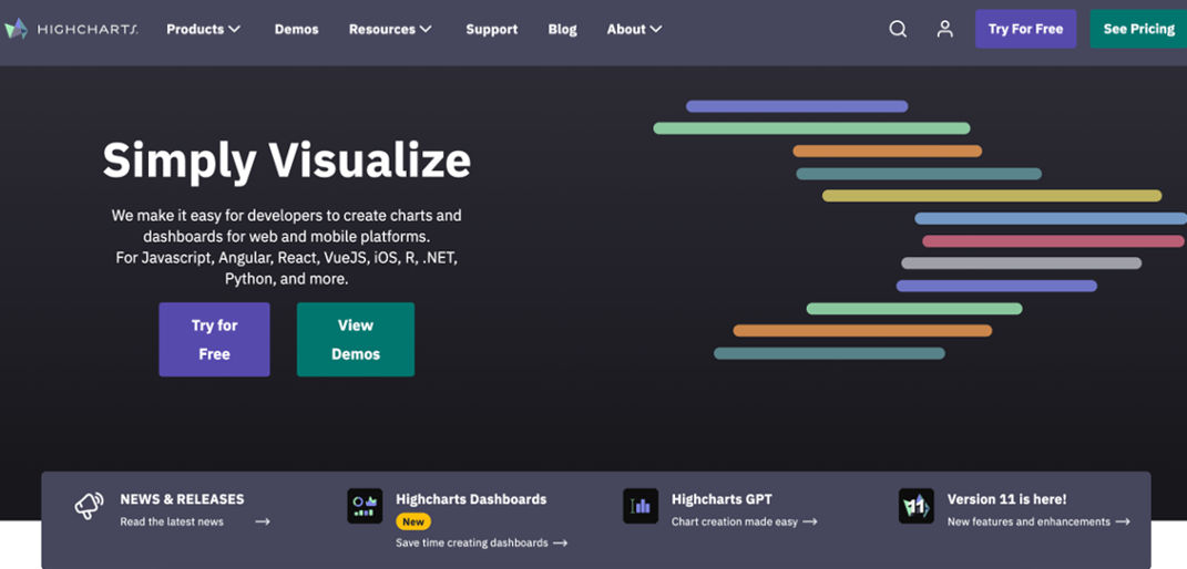
Source: Highchartz
Highcharts is an open-source JavaScript charting library. It allows you to display your data in a variety of interactive charts, from simple line and spline charts to interactive maps and treemaps. Highcharts goal is to make beautiful charts that are accessible to everyone. Highcharts brings people of all skill levels together and provides them with the best platform for creating visualizations that help them understand their data.
Pricing:
- Internal: $160 per year
- Saas: $316 per year
- Saas+: $788 per year
- OEM: Contact Highcharts for pricing details
Fusioncharts
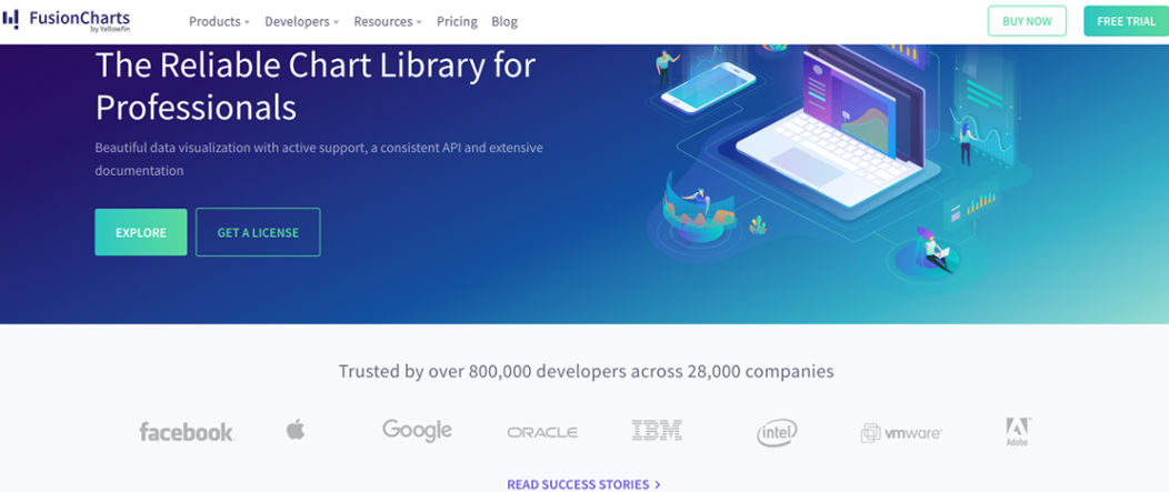
Source: FusionCharts
FusionCharts is the market leader in data visualization tools. They have been helping thousands of businesses worldwide to gain insights into their data and make better decisions with award-winning, easy-to-use, and feature-rich products.
FusionCharts has emerged as a leader in the industry by offering advanced, feature-rich charting solutions that can be easily integrated into any web application or website, be it a simple online chart or complex dashboard. With FusionCharts’s suite of products, you can create stunning charts & graphs for your website/application in minutes!
Pricing:
- Basic: $499 per developer
- Pro: $1,2999 per developer
- Enterprise: $2,499 per developer
- Enterprise+: Contact FusionCharts for pricing details
Qlikview
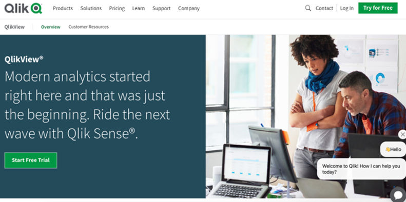
Source: QlikView
QlikView is a business intelligence (BI) tool that can be used to create interactive data visualizations. It allows people to quickly analyze data and make informed decisions with an easy-to-use interface that doesn’t require programming skills. QlikView is a fast and flexible BI tool that lets you create interactive visualizations of your data. You can easily share your findings with colleagues or customers, helping them to understand your analysis and take action on their insights.
Pricing:
- Qlik Sense: Free
- Qlik Sense Business: $30 per month
- Qlik Sense Enterprise: Contact Qlikview for pricing details
Conclusion
Exploring the twenty-one best data visualization tools for marketing has likely expanded your understanding of how effectively digital tools can transform raw data into compelling visual stories. From infographics that distill complex information into digestible visuals to dynamic platforms that offer a vivid description of consumer trends, the right tool can revolutionize the way you present and interpret marketing data.
If you’d like to harness the full potential of these tools, integrating them into your digital marketing strategy could be a game changer, enhancing how you communicate insights and make data-driven decisions. For more information on Data Visualization Tools for Marketing, check our other blogs. It will help you choose the right visualization tools and get the most out of them.
FAQs
What is data visualization and why is it important in marketing?
Data visualization is the graphical representation of data to help organizations understand trends, patterns, and insights from their datasets. In marketing, visualizing data is crucial for making informed decisions, spotting opportunities, and communicating complex information in a clear and engaging way.
How can data visualization tools benefit marketing professionals?
Data visualization tools allow marketers to create interactive charts, graphs, and maps that make it easier to interpret data, identify trends, and share insights with stakeholders. These tools help present data in a visually appealing and understandable format.
What are some common types of data visualizations used in marketing?
In marketing, common types of data visualizations include bar graphs, line charts, pie charts, scatter plots, heat maps, and infographics. Each type of visualization serves a specific purpose in conveying information effectively to the audience.
How can marketing professionals effectively use data visualization for storytelling?
Marketers can use data visualization to create compelling stories by incorporating data-driven insights in a visually appealing format. Professionals can enhance their storytelling and engage their audience more effectively by selecting the right visual elements and narrative structure.
Can data visualization tools help in improving decision-making processes in marketing?
Yes, data visualization tools play a crucial role in improving decision-making processes by providing marketers with a clear and concise view of their data. By visualizing data and identifying patterns, marketing professionals can make informed decisions that drive successful campaigns and strategies.
What are some best practices for using data visualization tools in marketing campaigns?
Some best practices for using data visualization tools in marketing campaigns include selecting the right visuals to convey the message effectively, incorporating storytelling elements, ensuring accessibility for all users, and using color schemes that facilitate understanding of the data.
How do data visualization tools contribute to better communication within marketing teams?
Data visualization tools facilitate better communication within marketing teams by providing a common platform for sharing insights, collaborating on data analysis, and presenting findings in a visually appealing and easy-to-understand manner. This enhances teamwork and ensures everyone is on the same page.


