
When it comes to creating and presenting information in creative ways, no other tool is as versatile as the data visualization tools. If you’re serious about giving data in different formats, this web-based software can help make your work more attractive and engaging.
A data visualization is a sort of information display that represents unorganized source data by using charts, graphs, maps, etc. The best part about these tools is that they can be used for any kind of data and any subject, including sales figures, demographics, budget reports, or other data types.
This article will discuss why data visualization is important, how it can benefit your business, and the best tools available for creating beautiful visualizations.
What is Data Visualization?

Source: Lukas of Pexels
Data science is a branch of computer science that deals with the collection, storage, analysis, and visualization of data in order to extract knowledge and insights.
Data visualization is the graphical representation of data to make it more meaningful and easier to understand data. It helps communicate ideas, information, and insights through graphs, charts, maps, and images.
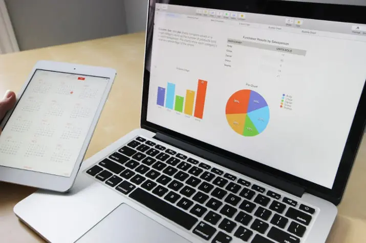
Data visualization tools convert data using visual representations that users can easily interpret. Examples include graphs and charts that display numerical information in a way that makes it easy to understand. These tools analyze large datasets, organize information, and generate reports that business users can easily understand.
A picture is worth a thousand words, and that’s precisely what data visualization tools do — they help you communicate your insights effectively to any audience.
Data visualization comes in many different forms — from charts and graphs to infographics, maps, timelines, and more — but all share the same purpose: to help people quickly see patterns in large amounts of information.
Various types of data visualization tools are available online, including those that allow users to create their custom graphs using pre-defined templates or interactive widgets. Some tools also allow you to share your visualizations with others via an embeddable code or an interactive map.
Data visualizations help users understand their data better by making it easier to read and interpret. The goal of data visualization is to simplify complex information so that it’s easier for people using different levels of understanding (including non-technical users) to understand what they’re looking at when they’re looking at a graph or chart.
Why Should Businesses Use Data Visualization Tools?
Source: Pixabay of Pexels
Data visualization tools are the most effective way to make sense of data. They help visualize the data and make it easy for people with different experience levels to understand. Data Visualization tools are also used for sharing your data with others, as well as for understanding your own business. Visualizing data can help you understand the numbers mean, spot trends and outliers, and decide based on your data analysis.
Data visualization methods are used to explore and present meaningfully hundreds of thousands, millions, or even billions of pieces of data. Data visualizations are an essential part of any business. They give you a clear picture of the information you need to analyze and understand. Data visualization tools are the best way to do this.
With the help of data visualization tools, you can easily create an eye-catching representation of your data. This helps people understand how your business works and what your goals are. It also helps them see what changes must be made to improve their performance.
Data visualization tools allow you to make better decisions because they provide clear insight into what is happening within your organization. You will be able to see trends, identify areas where improvement may be needed, and predict potential outcomes based on current trends within your company or industry.
What Are Some Popular Data Visualization Tools?

Source: Lukas of Pexels
Data visualization tools represent data in a way that makes it easy to understand and interpret. Data visualization tools are the best way to present your data more meaningfully. They help you know your numbers much better and also help you find patterns that you might have missed otherwise.
Here Are Some Popular Data Visualization Tools:
Tableau
Tableau is one of the most powerful data visualization tools out there, and it’s also one of the easiest to use. It’s easy to use even if you don’t have much experience with this type of software. It has an intuitive interface that provides an easy way to create interactive charts and graphs that can be embedded in any website. You can even connect Tableau with applications like Gmail, Google Sheets, Salesforce, etc.
Chartio
If you want more control over how your charts look, then Chartio is an excellent solution. It lets you create custom dashboards where you can choose what chart to use for each metric, making it very flexible when creating presentations for different audiences or needs.
Google Sheets
Google Sheets is a spreadsheet tool that allows users to create charts directly in the document itself. Many chart types are available, including pie charts and bar graphs, making it easy for users without coding experience to create professional graphics easily. Google Sheets is free and easy for anyone who wants to visualize their data quickly and easily.
How Does Data Visualization Tools Work?

Source: Mikael Blomkvist of Pexels
Data visualization tools are a great way to make sense of data and communicate it in a way that’s easy to understand.
Data visualization tools are used by professionals in every industry, from medicine and engineering to government agencies and businesses. Consumers also use them for personal projects, like tracking their finances or managing their health.
Data visualization tools can be used on desktop computers, mobile devices, and tablets. Some even offer cloud storage capabilities so you can access your files wherever you are.
Data visualization tools work by taking raw data from a database or spreadsheet and converting it into a visual representation that people can view easily without prior knowledge of statistics or coding.
These tools make it possible to generate complex charts and graphs that can then be used to present information in an easy-to-understand format.
The best thing about these tools is that they are available online, so they only take up a little space on your computer or require additional software downloads.
There are many different types of data visualization tools, but they all have the same primary purpose: to make it easier for people to understand complex information. Data visualization tools help people who need to make decisions based on lots of information.
How Do I Choose the Right Data Visualization Tool?

Source: Antony Trivet of Pexels
Data visualization has become a staple of business intelligence, marketing, and other areas where business owners must make data-based decisions. It allows them to interpret massive amounts of data and make better decisions faster. There are many examples of data visualization tools, e.g., Tableau, Looker, and Spotfire, that help you effortlessly visualize your data. There are several standard techniques and tools used in data visualization.
Data visualization tools have become necessary for data scientists, computer scientists, and business analysts. They are used to visualize and explore large datasets easily, quickly, and interactively.
When choosing the right data visualization tool, you should consider the following factors:
Data volume: First, you must consider how much data you deal with. Many free tools are available for smaller datasets, but if you need to work with big data sets, paid solutions will suit you.
Data complexity: You must also consider whether your data contains complex relationships. If so, a tool that allows visualizing interactive charts can be handy.
Visual appeal: Visual appeal is another important factor when choosing a data visualization tool — especially when displaying your results in presentations or reports. A good-looking chart can make all the difference!
User interface: The user interface of a tool is also essential because it can make your work easier or more complex, depending on how intuitive and user-friendly it is. For example, if you’re new to this kind of software, ease of use may be more critical than advanced features such as sharing options or collaboration features.
Who Can Benefit from Using Data Visualization Tools?

Source: Pavel Danilyuk of Pexels
Data and analytics is the science of using data to inform decisions. Data visualization tools are a great way to see the big picture from your data quickly. They can help you understand your data and make connections between different pieces of information that might not otherwise be apparent.
Data visualization tools can benefit anyone who needs to analyze extensive data, whether for business or personal use. For example:
Marketers can use data visualization tools to track trends in consumer behavior, monitor their competitors’ marketing campaigns, and analyze customer feedback.
Sales teams can use data visualization tools to spot trends in purchasing patterns and predict when customers will buy new products or services.
Researchers can use data visualization tools to gain insight into how people interact with their content online or offline, how they respond to surveys and other research methods, and what drives them to engage more deeply with a particular topic or initiative.
Conclusion
With more information available than ever, data visualization tools have become necessary for many businesses. By converting large, unorganized datasets into easily readable graphs, companies can gain critical insights into their operations and make more informed decisions.
Data visualization tools make predictions about complex data possible, allowing businesses to gain valuable insights for a competitive edge. If you’re looking for your next project, Look no further!
This all-in-one data visualization tool has all the features you need to create an outstanding visual representation of your data sources while keeping your audience engaged and informed. From time series to geographical maps, this tool can fit data values in almost any format.
Please visit our blog to learn more about the benefits of data visualization tools.
FAQs
What are some examples of charts?
There are many different types of charts you can use to display different types of data. Some examples include bar charts (for comparing items within categories), line charts (for showing trends over time), scatterplot graphs (for showing relationships between variables), bubble charts (for comparing values at different levels), etc. The type of chart you choose depends on your goal for displaying this kind of information and what type of data you have available.
Why use data visualization tools?
Data visualization tools help you understand and interpret your data more accurately by clearly showing what your numbers mean. You can easily see patterns in your data and identify trends to help you make better decisions.
What are some types of data visualization software?
Many data visualizations include bar charts, pie charts, line graphs, and scatter plots. Each type has advantages and disadvantages depending on what you must show in your data set.


