
Data is vital when it comes to making decisions. Analyzing information at a glance and drawing conclusions allows one to make wiser decisions. This is why data visualization tools are currently gaining popularity in all corners of the world.
Businesses, governments, and social organizations have had to adapt their decision-making processes, demanding the creation of visual data analysis methods. This list contains the best data visualization tools on the market, but most are expensive.
However, if you are a beginner and want to create your first few charts or graphs, then one of these FREE data visualization options on our list will suit your needs.
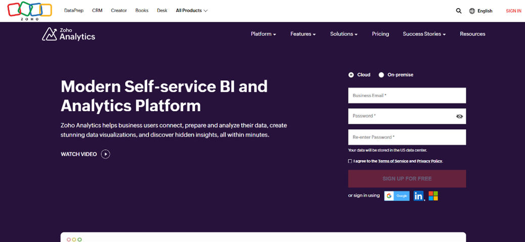
Zoho Analytics
Source: Zoho
Zoho Analytics is a data visualization tool that allows you to create charts, graphs, and reports from your organization’s data. This web-based application is suitable for businesses of all sizes and industries.
Zoho Analytics is a cloud-based business intelligence tool that can be used to track, analyze, and interpret your data. It has a wide range of features, including real-time visual analytics, streaming data collection, and visualization tools, as well as predictive analytics capabilities.
Zoho Analytics’ easy-to-use drag-and-drop interface makes it an ideal solution for non-technical users who want to analyze multiple data sources in one place.
Zoho Analytics provides out-of-the-box integration with hundreds of applications, including Zoho CRM, Zoho Books, MailChimp, and Salesforce.
Pricing
- Basic: $24/month
- Standard: $48/month
- Premium: $115/month
- Enterprise: $455/month
- Custom
A unique and powerful suite of software to run your entire business, brought to you by a company with the long-term vision to transform the way you work.
ClickUp
Source: ClickUp
There are a lot of options for data visualization. ClickUp is one of the best free tools that you can use to create beautiful and interactive flowcharts, org charts, mind maps, and more.
You can use it to share your ideas with others or keep track of all your projects and tasks. You can also use it to visualize your company’s hierarchy or organization chart.
The tool has an intuitive interface that makes it easy for anyone to use. You can drag and drop images from your computer onto the canvas or import hundreds of data from Google Drive, Dropbox, or OneDrive. There are also many tools for adding text, shapes, and lines and formatting them so you get exactly what you want on your canvas.
Pricing
- Free
- Unlimited: $7/member/month
- Business: $12/member/month
- Enterprise: Contact website
Work smarter as a team with real-time chat. Tag individuals or groups, assign comments for action items, and link tasks to get more done together.

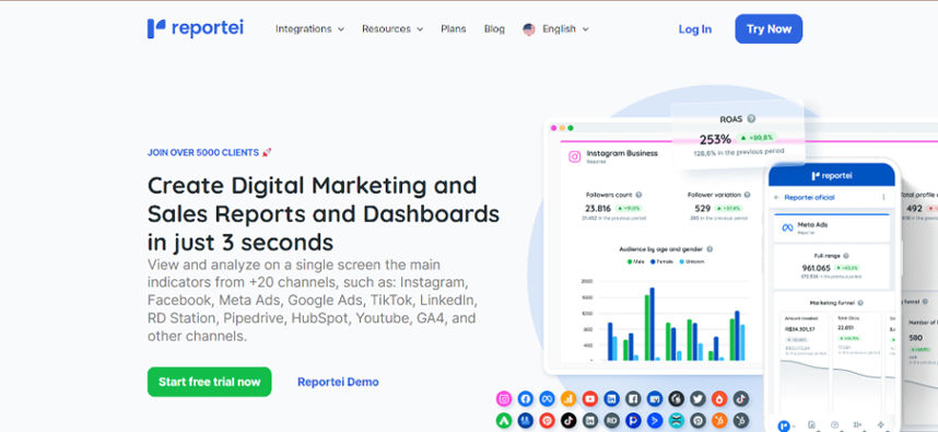
Reportei
Source: Reportei
Reportei is a data visualization tool that allows you to create interactive charts and graphs so that you can easily share and analyze your data.
Reportei is one of the best tools for creating data visualizations online. It has many features, including real-time charting, multiple chart types, and export options. You can also easily share your report with other users by just pasting a link!
It’s easy to use, but there are no templates or premade charts. However, it does have several customizable options available for each chart type, which makes it easier to customize your charts.
Pricing
- Starter: $24/month
- Pro: $39/month
- Premium: $79/month
View and analyze on a single screen the main indicators from +20 channels, such as: Instagram, Facebook, Meta Ads, Google Ads, TikTok, LinkedIn, RD Station, Pipedrive, HubSpot, Youtube, GA4, and other channels.
Microsoft Power BI
Source: Microsoft Power BI
Microsoft Power BI is an analytics tool that allows users to create and share interactive visualizations of data. It’s great for creating dashboards and reports, but it can also be used to create charts, graphs, and other types of visuals. For example, you can create a map showing where your customers are or what they buy.
Power BI has various features like dashboards, reports, KPIs, and visual representation. It also provides new features like custom visuals and an enhanced query editor, which makes it even more helpful for organizations.
Power BI also has some of the best connectors to other tools and services that allow users to share their visualizations with others in their organization. The platform also provides an integrated development environment (IDE) where developers can build custom apps and reports using Power Query. This tool lets users connect to multiple data sources, such as Excel spreadsheets or CSV files stored on their servers.
Pricing
- Contact Microsoft Power BI for pricing details.

Looker
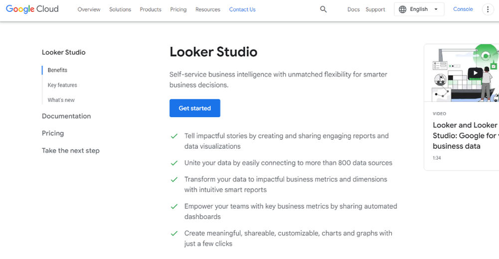
Source: Looker Studio
Looker is a data visualization tool that helps businesses make better decisions by delivering the right information to the right people at the right time.
Looker’s beautiful, intuitive interface allows you to explore and share data quickly, easily, and securely. Looker’s platform-agnostic approach makes it easy to integrate with any application and seamlessly move data around your organization.
With Looker’s advanced analytics platform, you can unlock insights in seconds that would take hours or days with traditional tools.
The Looker app can be used on any device and offers access to an intuitive search bar that enables users to search and filter through their dataset. Users can also create custom dashboards on the Looker app based on specific criteria or visualizations they wish to view.
Pricing
- Contact Looker for pricing details.
Meet with dedicated startup experts, connect with startup communities, and access Google-wide discounts

Tableau
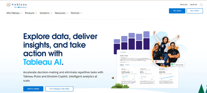
Source: Tableau
Tableau is the best data visualization tool. It provides a powerful and flexible platform for visualizing and analyzing your data.
Tableau data visualization makes it easy to connect and visualize your data in multiple ways. You can create interactive dashboards, share them on Tableau Public, or embed them on a website or blog. You can also analyze your data without writing a single line of code.
Tableau Desktop is an enterprise-level software program that’s designed for creating data visualizations for internal use. It can be used for any type of data, and it can be used by anyone who wants to get started with data visualization software.
Pricing
- Tableau Creator: $75/month
- Tableau Explorer: $42/month
- Tableau Viewer: $15/month
Domo
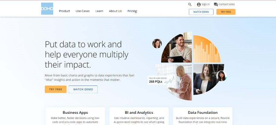
Source: DOMO
Domo is a data visualization tool. It’s an all-in-one business analytics platform that makes it easy for everyone in your company to ask questions, analyze data, and visualize insights using simple drag-and-drop tools.
Domo helps organizations make better decisions by providing the tools to collect, manage, and analyze large amounts of data from any source. The platform offers intuitive business intelligence software and databases that allow users to create custom applications for specific needs.
The software gives users real-time information about their business operations and sales performance to stay competitive.
Domo offers an online version that allows you to access your data through any web browser on any device and through mobile apps for iOS and Android devices.
Pricing
- Contact DOMO for custom pricing.
JupyteR
Source: Jupyter Notebook
JupyteR is a data visualization tool that allows you to create beautiful and interactive graphs. JupyteR is an open-source project, so it’s entirely free to use.
Jupyter is a powerful tool for exploring and analyzing data. It is also known as Jupyter Notebook, which is a web-based application that allows you to create and share documents that contain live code, equations, visualizations, and narrative text.
Pricing
- Contact JupyteR for pricing details.
RAWGraphs
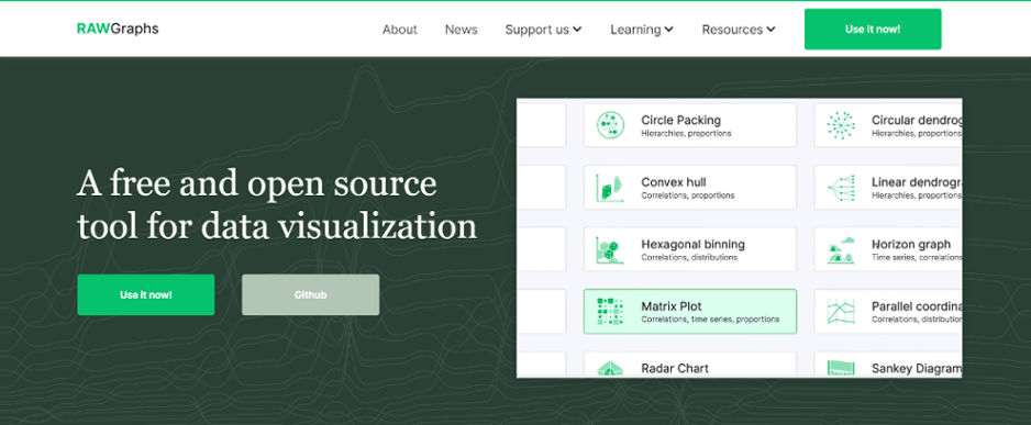
Source: www.rawgraphs.io
RAWGraphs is a data visualization tool that helps you create beautiful and functional graphs. RAWGraphs is the easiest way to create a beautiful graph, so you can share it with others or embed it on your website.
RAWGraphs provides many graphs, including lines, bars, pie charts, and many more. They also provide advanced features, such as multiple charts on the same page and real-time updating for dynamic data.
You can create any chart quickly and easily by manually entering values or linking multiple datasets. Once you have created your chart, you can share it with others by exporting it to PNG or JPEG format or embedding it directly into your website.
Pricing
- Contact RAWGraphs for pricing details.
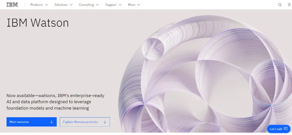
IBM Watson
Source: IBM Watson
IBM Watson Analytics is a business intelligence tool that makes it easy to analyze and visualize data. The software offers analytics capabilities across industries, including retail and finance.
IBM Watson is a powerful tool that can be used to analyze vast amounts of data. It can also be used to create data visualizations. There are many ways to use IBM Watson, so it helps to know what they are and how to use them.
IBM Watson is an AI platform that uses natural language processing and machine learning to reveal insights from large amounts of unstructured data. Watson continuously learns from new data, gaining value and knowledge over time.
Pricing
- Contact IBM Watson for pricing details.
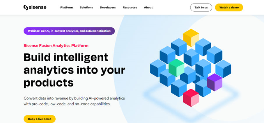
Sisense
Source: Sisense
Sisense is a data analytics platform that enables users to view, explore, and share large amounts of data.
Sisense is a business intelligence and analytics platform that allows businesses to analyze their data from different angles and in real-time. With Sisense, you can gain instant insights and make better business decisions.
Sisense offers several features that can help you make sense of your data, including dashboards, charts, and reports. You can also create custom visualizations by using the built-in drag-and-drop visualization tool.
The Sisense BI platform enables businesses to uncover insights from their data through intuitive visualizations and dashboards. It allows users to quickly create powerful reports that can be shared across an organization in minutes. Users can also share dashboards with others and collaborate on projects via Sisense’s Shared Dashboards feature.
Pricing
- Contact Sisense for custom pricing.
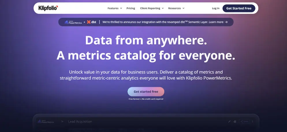
Klipfolio
Source: www.klipfolio.com
Klipfolio is a cloud-based data visualization and reporting tool that helps businesses make sense of their data. Klipfolio provides live, real-time dashboards and visual reports that can be embedded on any website or social media platform.
Klipfolio provides a range of features to help users track their business performance over time. The application can also create interactive dashboards that can be shared with colleagues and clients on an internal website or the web. The application also supports real-time data collection from multiple sources, including Google Analytics and Salesforce.
Klipfolio helps you create compelling dashboards and visualizations to display your business metrics and gain insights into your business’ performance. It also offers a free trial to get started without risk or obligation.
Pricing
- Free
- Go: $90/month
- Pro: $225/month
- Business: annual plan starts at $800
Plotly
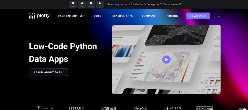
Source: Plotly
Plotly is a data visualization tool that allows you to create interactive graphs and charts. It’s an online tool, so no software to install or sign up is required.
Plotly is a powerful tool that can help you visualize your data in many ways. You can create graphs, charts, maps, and more with ease. You can even embed your graphs on your website or blog.
Plotly’s intuitive user interface makes creating interactive plots, dashboards, and presentations easy. You can drag and drop points, lines, bars, and text directly onto the canvas to create interactive charts in seconds.
Pricing
- Contact Plotly for custom pricing.
Qlik Sense
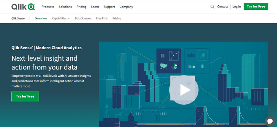
Source: Qlik Sense
Qlik Sense is a data visualization tool that allows you to create interactive visualizations and dashboards. You can use it to answer critical business questions and make better business decisions.
It’s an excellent tool for non-technical users because it doesn’t require any programming or coding experience. It also works with hundreds of different types of data sources, so you don’t have to worry about the format of your data.
Qlik Sense enables users to build quick data visualizations using drag-and-drop functionality. Users can share their work with others by publishing dashboards to the web or mobile devices. They can also use pre-built apps to create complex dashboards in less time than it would take them otherwise.
Pricing
- Standard: $20 user/mo
- Premium: $2700/month
- Enterprise: Custom pricing
Dundas BI
Source: Dundas BI
Dundas BI is a business intelligence suite for exploring, analyzing, and presenting data. Dundas BI provides an array of tools for visualizing data, creating reports and dashboards, and sharing analytics across your organization.
Dundas BI has robust capabilities for analyzing and visualizing your data. It includes everything you need to build compelling dashboards that make it easy for anyone in your organization to access the information they need to make better decisions.
Dundas BI has a rich feature set with hundreds of prebuilt visualizations available out of the box. Users can also create custom visualizations using the built-in chart editor or third-party tools like Tableau or PowerBI.
Pricing
- Contact Dundas BI for pricing details.
Visual.ly
Source: Visual.ly
Visual.ly is a website with the best data visualization tools to help you create beautiful visuals. You can use it to make infographics, interactive charts, and maps. Visual.ly is also a great place to find inspiration for your next infographic project.
Visual.ly makes creating beautiful and shareable infographics and presentations easy with the most popular data visualization tools online.
Visual.ly’s design templates make it easy to start creating your infographic or presentation in minutes, with no design skills required!
Pricing
- Contact Visual.ly for pricing details.
Highcharts
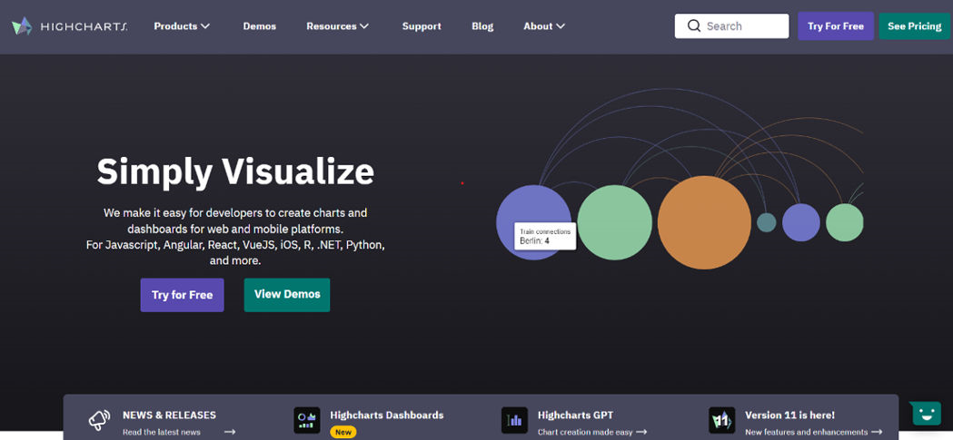
Source: Highcharts
Highcharts is one of the most popular data visualization tools available today. It allows users to create interactive charts easily without having any programming skills. The best thing about Highcharts is that it works on all major browsers and platforms, including tablets and smartphones. This makes it easy for users to access their charts anytime, anywhere.
Highcharts has been developed to provide a solution to developers who want to add interactive charts and graphs to their websites. The goal is to make it easy for developers to create beautiful visualizations that support all modern browsers while fully customizable to meet different needs.
Highcharts uses the HTML5 canvas element, and it has been designed to look good on all devices (desktops, tablets, and mobiles).
Pricing
- Internal: $160 per seat annually
- SaaS: $316 per seat annually
- SaaS+: $788 per seat annually
- OEM: Get a quote
Fusioncharts
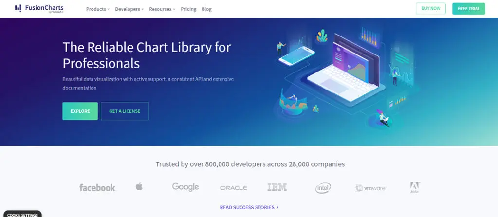
Source: Fusion Charts
FusionCharts is a comprehensive suite of data visualization tools and charting components for web and mobile applications.
FusionCharts is a suite of data visualization tools that helps to create interactive charts, graphs, and dashboards. The chart gallery contains the most popular types of graphical representations of data. The chart wizard lets you choose the most appropriate charting tool for your data exploration.
FusionCharts offers more than 100 chart types, allowing users to integrate them with their applications. The company also provides an online editor, making it easy for developers to create new charts without coding.
Pricing
- Basic: $439/year
- Pro: $1899/year
- Enterprise: $3399/year
- Enterprise+: Request a quote
Data Wrapper
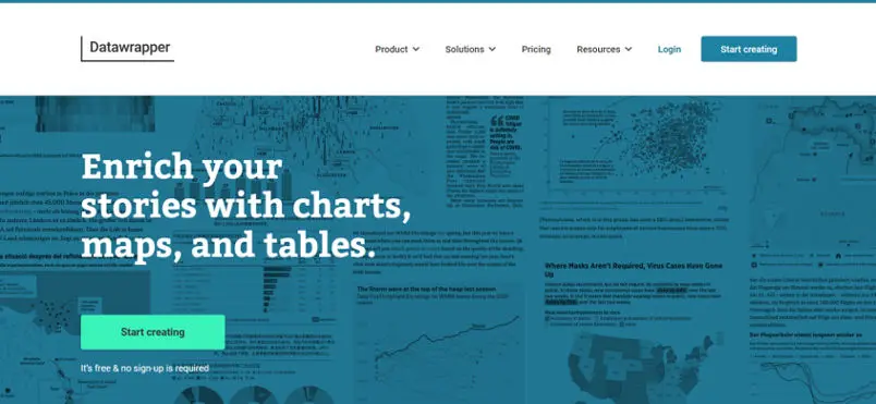
Source: Data Wrapper
Data Wrapper is a data visualization tool that allows you to create interactive charts, graphs, and maps using your data. You can visualize your information in various ways, including bar charts, line graphs, pie graphs, scatter plots, and bubble charts.
Data Wrapper supports many data types, including numbers (integer and decimal), dates/times, and text. It also supports multiple layers of hundreds of data to visualize numerous datasets simultaneously!
Data Wrapper is highly customizable and features a rich set of built-in widgets, so you don’t need to code or use any special software to create great-looking visualizations.
Data Wrapper provides predefined layouts and designs you can use as-is or modify using the built-in customization tools. You can also create your custom layouts, which allows you to build any visualization you want without any required programming experience!
Pricing
- Free
- Custom: $599/month
- Enterprise: Contact website
Google Charts
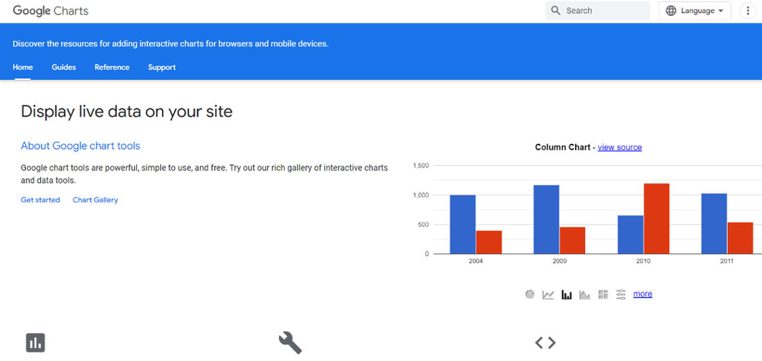
Source: Google Charts
Google Charts is a free tool for creating interactive data visualizations. It’s flexible and easy to use.
Google Charts is a set of tools that allows you to create interactive charts and visualizations from your data. It is a JavaScript library, which means it can be used in any programming language.
Google Charts can be used to create charts and graphs in HTML5 applications such as websites or mobile apps.
With Google Charts, you can easily visualize your large data sets in various formats, including line charts, bar charts, area/scatter plots, pie charts, heat maps, and more. The charting library also supports many interactions, including panning, zooming, and drill-down capabilities for individual series.
Pricing
- Contact Google Charts for pricing details.
Infogram
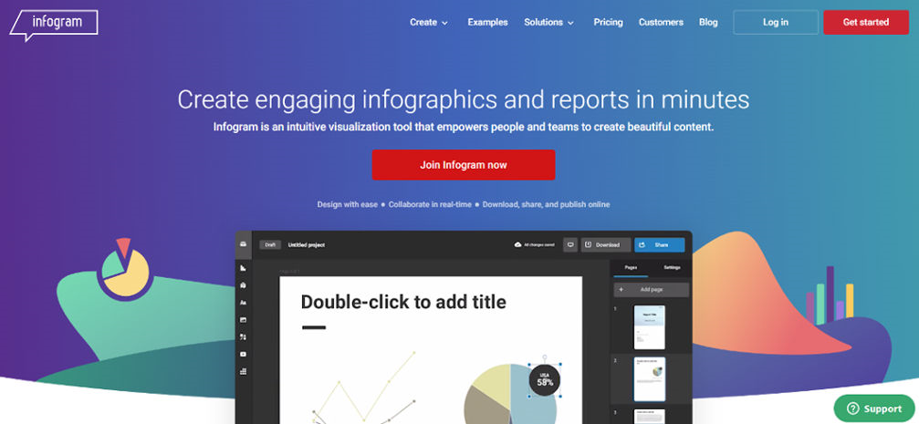
Source: Infogram
Infogram is a data visualization tool that lets you create, edit, and share professional-quality charts, graphs, maps, and infographics.
Infogram provides an easy-to-use yet powerful platform to create, edit, and share beautiful charts, graphs, maps, and infographics.
It’s completely free to use and super fast to set up. You can easily embed your chart in a blog post, website, or presentation. Or, if you want more control, export as PNG or PDF for use elsewhere.
Infogram has been used by thousands of people worldwide to make their data-based presentations more impactful.
Pricing
- Basic: Free
- Pro: $19/month
- Business: $67/month
- Team: $149/month
- Enterprise: Contact website
ChartBlocks
Source: ChartBlocks
ChartBlocks is a data visualization tool that allows you to easily create charts and graphs from a wide variety of data sources. ChartBlocks has an extensive library of pre-made chart templates, but you can also customize your own chart or graph by dragging and dropping different elements onto the canvas.
ChartBlocks is a free online tool for creating charts, graphs, and infographics. It is a useful tool to create online charts and graphs for presentations, blogs, websites, or any other documents. The best thing about ChartBlocks is that it provides you with a wide range of templates and layouts to choose from.
ChartBlocks offers an extensive library of chart styles, including bar charts, line charts, pie charts, area graphs, and bubble plots. It also allows you to create custom charts based on your data using their advanced chart editor.
Pricing
- Contact ChartBlocks for pricing details.
D3.js
Source: D3.js
D3.js is a JavaScript library for visualizing data using data web standards. It creates graphs, charts, maps, and custom data visualizations for the web.
D3’s emphasis on web standards gives it cross-platform support, while its emphasis on data-driven documents allows you to integrate dynamic behavior easily.
Data visualizers have widely adopted D3 because it builds on top of the same browser technologies they use daily to build web applications: HTML, CSS, and JavaScript. It uses these same tools to create interactive charts and graphics that are more powerful than most developers could build on their own.
D3 has no external dependencies, so that you can add it to any website with a few lines of code.
Pricing
- Contact D3.js for pricing details.
Canva
Source: www.canva.com
Canva is a great tool for data visualization. It has the option to create a variety of different types of charts, including bar graphs, pie charts, line graphs, and more.
It’s also easy to customize the colors and text on your chart to match your brand and message.
Canva has an extensive library of templates, images, and fonts that you can use to create your designs. They also have an extensive collection of stock photos, which can be purchased for a small fee.
Canva is free to use, and you can even upload an image from your computer or take a photo with your phone’s camera. Canva is an excellent tool for beginners because there are so many different things that you can do with it. You can use Canva to create great-looking social media posts, advertisements, and more.
Pricing
- Canva free
- Canva Pro: ₱2490/year for one person
Chart.js
Source: Chart.js
Chart.js is a data visualization tool that allows you to easily create charts. It’s cross-browser, responsive, and touch-friendly.
Chart.js has various chart options, including line, bar, pie, area, and polar charts. With Chart.js, you can easily create custom layouts for your charts or use the pre-made templates available on their website.
The chart.js library provides 17 types of charts, including line, area, bar, pie, and more. The best part about chart.js is that it’s highly customizable and extensible, allowing you to create any type of chart imaginable with very little code!
Pricing
- Contact Chart.js for pricing details.
Grafana
Source: Grafana
Grafana is a data analytics and visualization platform that allows users to create real-time dashboards and graphs.
It’s an open-source, powerful tool that allows you to visualize your data in real-time. You can also build custom graphs and alerts with the help of this tool.
Grafana provides a vast range of pre-built dashboard templates. It also allows you to create your custom dashboards. The best part about this platform is its free version and paid plans.
Grafana has a simple user interface where you can create custom dashboards by dragging and dropping different panels. The best part about this tool is that it doesn’t require any coding skills or knowledge to use effectively. The user interface is pretty intuitive, so even if you know nothing about software development, you will find it easy to use Grafana for data visualization.
Pricing
- Cloud Free
- Cloud Pro: $29/month
- Cloud Advanced: $299/month
MongoDB Charts
Source: Mongo DB
MongoDB Charts is a powerful data visualization tool that allows you to create beautiful charts and reports on your MongoDB data. It’s the perfect tool for developers, analysts, marketers, and anyone who needs to explore data in their MongoDB database.
MongoDB Charts is a platform for creating beautiful charts from MongoDB data. It’s built on top of the MongoDB query language and is designed to be user-friendly, flexible, and powerful. MongoDB Charts is designed to be easy to use, flexible, and powerful. They support many chart types and give you control over every aspect of your visualization.
The application has a clean, easy-to-use interface supporting various chart types and visualizations. You can also share your charts with others by embedding them in web pages or blogs.
Pricing
- Contact MongoDB Charts for pricing details.
BrightGauge
Source: BrightGauge
BrightGauge is a data visualization tool that helps you to make data-driven decisions. It helps to collect, visualize, and share business metrics across the organization.
BrightGauge provides a simple drag-and-drop interface with hundreds of preconfigured charts, tables, and graphs to give you the power to create beautiful, interactive dashboards. With built-in tools for sharing your work with colleagues and clients, BrightGauge makes it easy to get everyone on the same page – quickly.
BrightGauge provides product data visualization tools and dashboards that allow you to gain insight into your product sales and performance.
Pricing
- Standard: $316/month
- Enterprise: $436/month
- Enterprise+: $616/month
Forsta
Source: www.forsta.com
Forsta is a data visualization tool that can help you make sense of your data. With Forsta, you can create charts, graphs, and maps. You can also combine multiple charts to get a complete picture.
Forsta offers many chart types, including line charts, bar charts, area charts, and more. You can also create your chart from scratch by selecting the elements from a list of available components.
As you create your chart, you will notice that each element has its own settings options. These include the size, color, border, and other properties you can customize according to your needs.
This tool is very simple and easy as it doesn’t require any programming skills or knowledge of coding languages to create beautiful visualizations for your data sets.
Pricing
- Contact Forsta for pricing details.
AgencyAnalytics
Source: AgencyAnalytics
AgencyAnalytics is a data visualization tool that helps digital marketers make better decisions by providing actionable insights. The product allows users to track their website’s traffic and conversion metrics over time, helping them understand how changes in their marketing strategy affect their business.
AgencyAnalytics lets you view your data in graph or table form or as a heatmap. It also has a feature called “heatmaps,” where you can see the number of clicks on each part of your website. If you want to track specific keywords, you can enter them in the keyword field and then choose whether you want to see the results for that keyword only or for all keywords on your site.
The tool also gives you access to valuable features like A/B testing tools, conversion rate optimization tools, email marketing tools, and social media analytics tools.
Pricing
- Freelancer: $12/month
- Agency: $18/month
- Enterprise: Custom
Sigma.js
Source: Sigma.js
Sigma.js is a JavaScript library for data visualization. It’s built on top of D3 and provides additional functionality for handling high-dimensional datasets.
Sigma.js is an extension of the D3 library, and it can be used to create charts, graphs, and other visualizations. Sigma provides an easier way to work with large datasets using a new data structure called Sigma-array.
Sigma.js is designed to be highly customizable by modifying only a few lines of code. You can also use our Sigma Editor web application to design your charts without writing any code!
Pricing
- Contact Sigma.js for pricing details.
Polymaps
Source: Polymaps.org
Polymaps is a data visualization tool that allows you to create and share your maps. It is an open-source tool that can be used by anyone who wants to visualize their data.
The tool is easy to use and has a wide range of features. It offers a variety of map shapes, including rectangular, hexagon, and polar maps. Polymaps also provides an extensive library of location data sources, including OpenStreetMap, MapQuest, Google Maps, and Yahoo Maps.
Users can choose from over 30 map types, such as choropleth, Dot Density, and heat maps. They can also customize their maps by adding backgrounds, labeling points, highlighting areas, and more using the built-in editor.
The tool has been developed for non-technical users who want to create complex visualizations without coding skills or specialized knowledge about geospatial data visualization techniques.
Pricing
- Contact Polymaps for pricing details.
Visme
Source: Visme
Visme is the best data visualization tool for business. It’s easy to use, and it’s free!
Create infographics, mind maps, business dashboards, social media graphics, and more in minutes.
Visme is a cloud platform that allows you to create stunning visual content with ease. The platform offers over 700 templates that you can use to create your own visual content. These templates range from standard infographics to pie charts and bar graphs. The platform also has templates for social media graphics, including Facebook cover photos and Twitter headers. You can also create your custom template by using the Visme Editor tool, which allows you to customize any of the existing templates or create your own from scratch.
Visme offers tools that are simple to use, but powerful enough to create stunning visuals with just a few clicks. You can make amazing data visualizations, including charts, graphs, maps, and infographics.
Pricing
- Basic: Free
- Starter: $12.25/month
- Pro: $24.75/month
- Visme for Teams: Contact website
Grow.com
Source: www.grow.com
Grow.com is a data visualization tool that allows users to create interactive data visualizations and share them on social media. It’s easy to use and offers a variety of chart types and templates that can be customized with a variety of colors, themes, and fonts.
Grow.com also offers an advanced feature set that allows sharing charts across multiple devices, saving charts as PDFs, embedding charts on websites or social media platforms, adding maps and geolocation data to visualizations, using images in charts, and much more.
The data visualization tools offered by Grow are easy to use, and they don’t require any prior knowledge of coding or programming languages. This makes them ideal for those new to this field of study or want to explore it further.
Pricing
- Contact Grow.com for pricing details.
Datapine
Source: Datapine
Datapine is a web-based data visualization tool that lets you create interactive charts and maps. The platform is great for creating infographics, dashboards, and other visualizations for your website or blog.
Datapine has diverse chart types, including pie charts, line graphs, bar graphs, column charts, area graphs, scatter plots, bubble charts, and many more. You can also create sophisticated maps with Datapine’s built-in map editor.
The software features an intuitive drag-and-drop interface that makes adding new elements to your chart or map easy. You can also customize the design of each element using simple editing tools like text alignment and font size adjustments.
If you want to see how your chart will look in print form before publishing it online, Datapine allows you to export your charts as PDF documents or JPEG images for sharing on social media sites like Facebook and Twitter.
Pricing
- Contact Datapine for pricing details.
Whatagraph
Source: whatagraph.com
Whatagraph is one of the best data visualization tools available online. It allows users to create eye-catching charts, graphs, and diagrams with ease. The tool provides an option of importing data from Google Sheets or Excel files, which makes the process even more convenient for users who are not familiar with coding languages like HTML or CSS. It also supports exporting data as PNG image files in both vertical and horizontal orientations.
The user interface of Whatagraph is very simple and easy to use, even if you have no technical knowledge about coding languages or designing charts and graphs manually. You can select different colors for different bars in your chart according to your choice and customize them according to your requirements easily without any problem at all!
Pricing
- Professional: starts at €199/month
- Premium: starts at €299/month
- Custom: Custom pricing
Pathlight
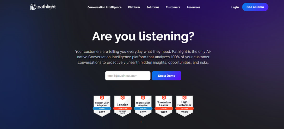
Source: www.pathlight.com
Pathlight is a data visualization tool that enables you to create beautiful data visualizations in minutes. With Pathlight, you can easily create charts and graphs to display your data in an informative way.
Pathlight is a free online tool that allows you to create beautiful dashboards, infographics, and reports from your data. You can also use it to manage your Google Analytics data and get insights into your website traffic. The best thing about Pathlight is that it has no limitations on how many projects you can create or how many users you can add to a project. The only limitation is the 500MB storage space limit per project, which should be enough for most people.
The best part about Pathlight is that it offers many different ways to visualize your data. You can choose between bar charts, pie charts, and maps. You can also create interactive graphs that allow users to filter and sort the data themselves.
Pricing
- Contact Pathlight for pricing details.
Databox
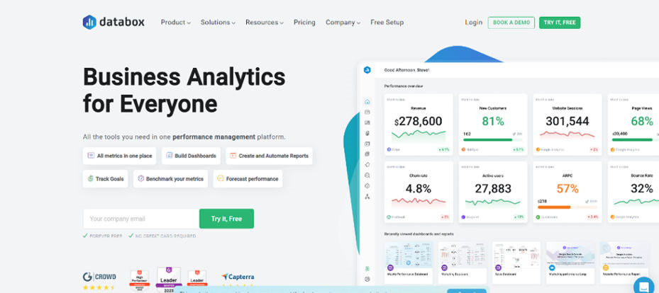
Source: databox.com
Databox is a tool for building data visualizations. It’s designed to help you create beautiful, interactive charts, maps, and other data-driven content.
Databox provides users with all the tools they need to create stunning visualizations that can be shared on social media or embedded into websites. Users can choose from hundreds of charts and maps from stock photo libraries, or upload their own images.
The interface is intuitive, making it easy for anyone to get started creating visualizations. There are no restrictions on what you can build with Databox; it’s free to use, and there are no monthly fees.
Pricing
- Free
- Starter: $47/month
- Professional: $135/month
- Growth: $319/month
- Premium: $799/month
Salesforce Marketing Cloud Intelligence
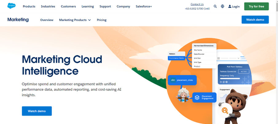
Source: Salesforce Marketing Cloud Intelligence
Salesforce Marketing Cloud Intelligence is a data visualization tool that allows marketers to analyze customer data and discover insights from data that can be used to improve their marketing strategies. It’s cloud-based so you can use it from any device with an internet connection.
The Salesforce Marketing Cloud Intelligence is a powerful tool that helps you discover new trends and opportunities in your business. The platform allows you to analyze and make the most of your data by providing actionable insights. It also provides many features that let you build interactive dashboards and visualizations to analyze and monitor your marketing campaigns.
Salesforce Marketing Cloud Intelligence uses artificial intelligence (AI) technology to understand your website visitors and customers. It provides you with visualizations and charts to easily see their behavior trends. This helps you identify what content they like to read on your website, what content gets them engaged on social media, and when they’re most likely to purchase from your site or app.
Pricing
- Contact Salesforce Marketing Cloud Intelligence for pricing details.
Conclusion
Data visualization is the science of understanding the patterns and relations behind the data. Data visualization tools are really helpful for visualizing different types of datasets most effectively. There are many online, free, and paid data visualization tools available, but picking the best one is always a difficult task. So we have tried to provide you with a list of top data visualization tools that will make this job easier with their beautiful features. They are not only good for visualizing data but also for making it readable and clear.
Please visit our blog to learn more about Data Visualization Tools.
FAQs
What are the best data visualization tools?
There are a lot of different data visualization tools out there, but not all of them are created equal. Some tools will help you do more than others. For example, if you want to create charts and graphs from your data, then Tableau would be a good choice because it can do that really well. However, if you want to create interactive maps or timelines, then Google Sheets would be better suited for that purpose.
What are some examples of data visualization tools?
Data visualization tools include charts, graphs, diagrams, maps, and infographics. There are many different types of data visualization tools that you can use depending on your needs. Charts and graphs are the most common type of data visualization tool used in business today. However, there are also other types of charts such as pie charts or line charts that can be used to visualize your data in a more creative way than a standard bar or column chart would allow.
What are the different types of data visualization?
The most common types of data visualization are charts, graphs, maps, and infographics. They can be static (a single image) or interactive (interactive chart or graph).


